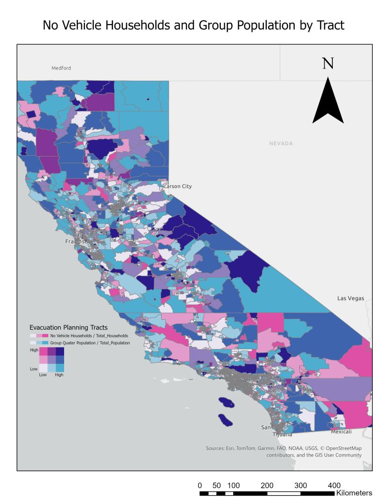

Here’s an ArcGIS map I made for an assignment where I needed to create a map to aid in wildfire evacuation planning. I used the data provided to compare Group Quarter Population Density with households who don’t have access to a vehicle. The figures were normalized based on the average in each of their own tracts. This is a great example of how two measures of data can be visualized at once for each individual area.